PROJECT
An Administration Comparison Tool for VYVGART Hytrulo
An Administration Comparison Tool for VYVGART Hytrulo
Blog Usability Improvements
A/B Testing
SEO Features
overview
Key stakeholders of The Checkup sought to enhance the blog's usability, boost monthly traffic, and ultimately drive readers to engage with the SingleCare app. I took the lead on this usability improvement initiative, collaborating closely with key team members, conducting A/B testing, and partnering with a developer to ensure seamless implementation of the upgrades.

DATE
March 1, 2023-
November 9, 2023
March 1, 2023-
November 9, 2023
MY ROLE
UX/UI Design Lead
UX/UI Design Lead
TOOLS AND TECH
Figma
Adobe Illustrator
Adobe Photoshop
Airtable
Asana
Figma
Adobe Illustrator
Adobe Photoshop
Airtable
Asana
CORE TEAM
1 UX/UI Designer
1 Developer
1 Strategist
2 SEO Strategists
1 UX/UI Designer
1 Developer
1 Strategist
2 SEO Strategists
background
The Checkup: Trusted health information from SingleCare
The Checkup: Trusted health information from SingleCare
The Checkup is an informative resource dedicated to health, wellness, and savings on healthcare. It features a diverse range of topics, empowering readers to make informed decisions about their health while managing medical expenses more effectively.
With 2 million monthly users, the blog serves as a significant marketing channel for SingleCare.
Recognizing its potential, key stakeholders approached me with a mission to improve the blog’s usability, ensuring readers could seamlessly engage with the content and maximize its value.
context
This project was initiated by internal stakeholders to address key business objectives on The Checkup. These main objectives included:
Improve user
accessibility
Improve user
accessibility
Streamline and simplify the user journey
Streamline and simplify the user journey
Increase engagement
and interaction
Increase engagement
and interaction
stakeholder insights
The stakeholders gave me important insights and barometers for what they would consider success and the main objectives for the project.
Add SEO-focused features to help users find the blog
Add SEO-focused features to help users find the blog
Add SEO-focused features to help users find the blog
Incorporate usability improvements to elevate the user experience
Incorporate usability improvements to elevate the user experience
Incorporate usability improvements to elevate the user experience
Incorporate advertising to monetize blog visits
Incorporate advertising to monetize blog visits
Incorporate advertising to monetize blog visits
user problem
User Problem
Navigating health concerns can be overwhelming and intimidating for users, who need a trustworthy, accessible, and user-friendly source to find accurate and reliable health information.
Navigating health concerns can be overwhelming and intimidating for users, who need a trustworthy, accessible, and user-friendly source to find accurate and reliable health information.
FEATURE PRIORITIZATION
By collaborating with our product, SEO, and editorial teams, I was able to better understand both the goals of the business, and the user needs that would be taken into consideration through doing this project.

project mangement
To keep the project on track and running efficiently, we utilized two project management tools to organize and streamline tasks:
AirTable was employed by our editorial team to track and manage the new features we aimed to implement.
Asana was used to share Figma links and designs with the larger team for review, as well as to facilitate the design handoff to our developer.
collaboration with development
collaboration with development
Collaborating with a freelance developer, I designed a system to streamline handoff and communication. By scheduling bi-weekly meetings, I was able to walk him through my designs, explain their intended functionality and interactions, and ensure he had all the information needed to execute them accurately.
Each meeting began with a clear agenda, followed by a review of any A/B testing results, and then we walked through the latest updates that were ready for development. This structured approach ensured alignment and efficient progress throughout the project.
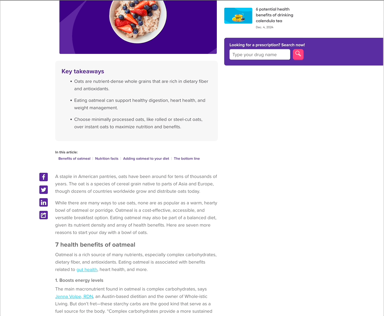
Reading time
The first usability improvement we implemented was adding a read-time estimate to each article. This small yet impactful feature enhanced the user experience in several key ways:
Added transparency: It gave readers a clear understanding of the time commitment upfront, helping them decide whether to engage with the content.
Reduced bounce rates: By setting expectations, it encouraged users to stay on the page and complete the article.
Increased confidence: Knowing the read time helped minimize the overwhelm often associated with longer content.
Enhanced predictability: This thoughtful addition added a layer of professionalism and polish to the blog, creating a more reliable and user-friendly experience.

key takeaways
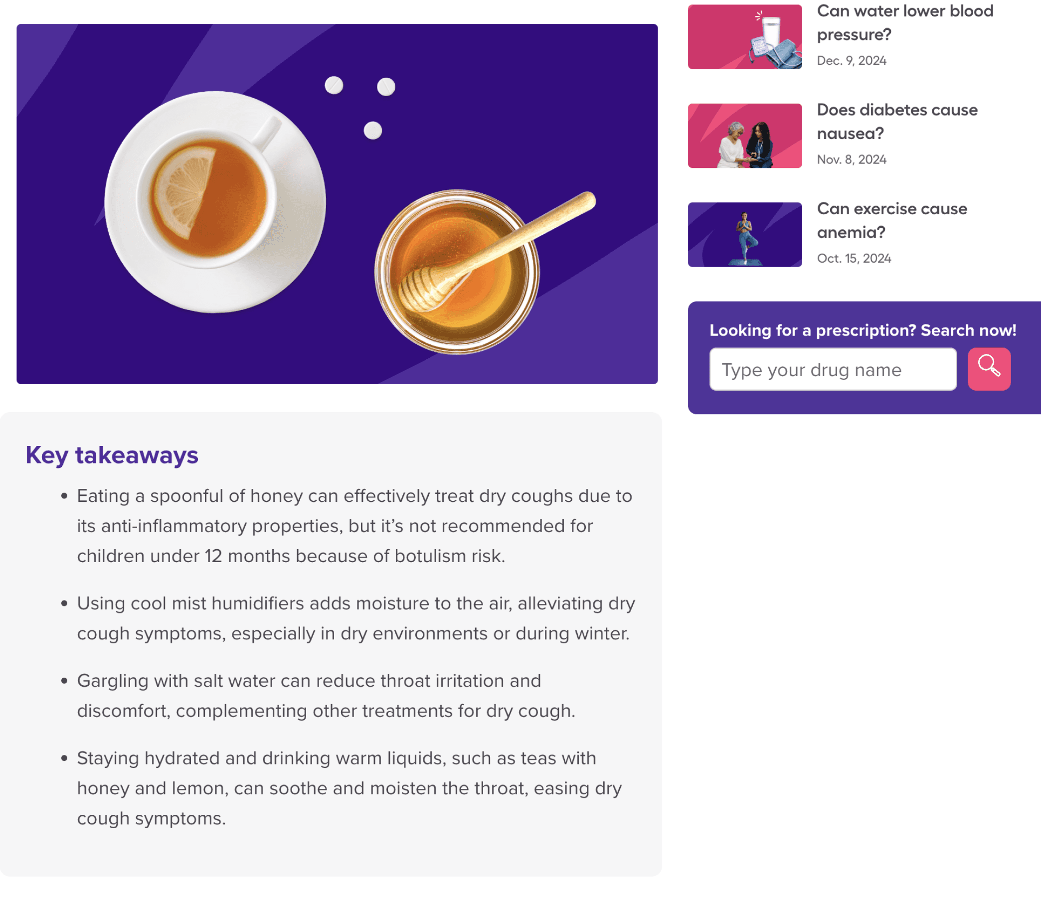
At the beginning of each blog post, we added a key takeaways section. This had a few positive implications for users:
Accommodated Different Learning Styles: Visual or textual summaries supported users who prefer condensed information, making the information accessible to a larger population
Reinforced Key Messages: Summarizing the main ideas helped readers retain the most critical information
Encouraged Deeper Reading: This boosted engagement by providing a preview of the content to entice readers to explore the full article
Elevated Credibility: A well-organized blog with clear summaries was perceived as more trustworthy and authoritative
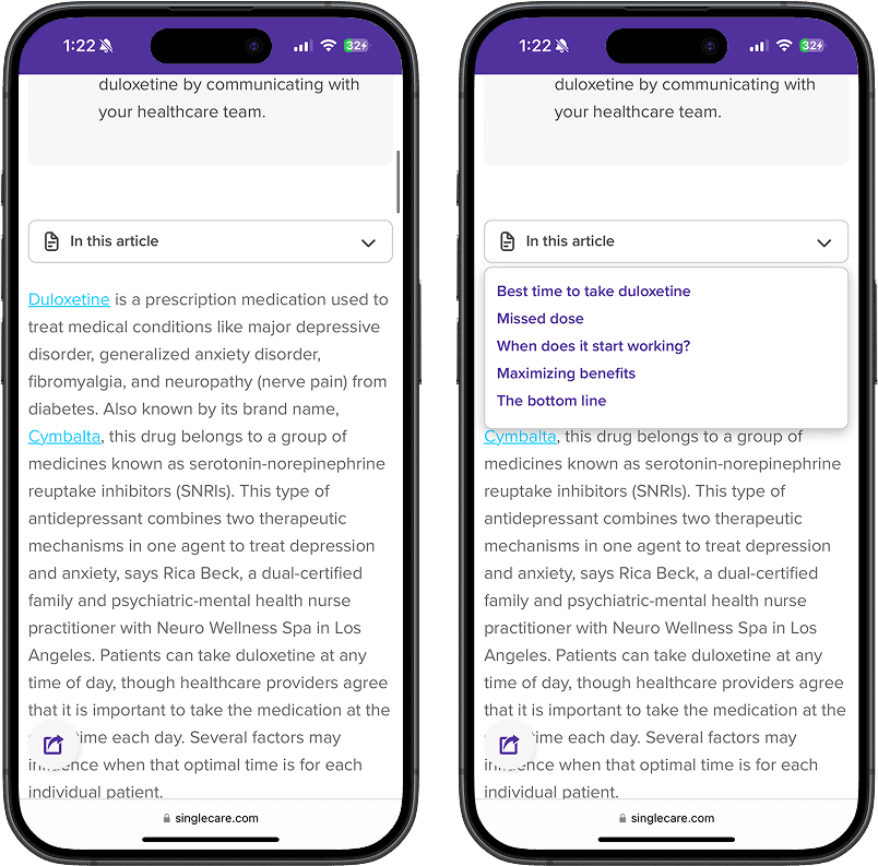
story highlights
Next, we added a story highlights section to make it easier for users to find the content they were looking for. This had a few main
outcomes:
Streamlined user journey: Adding the highlights section made the content easier to explore and simpler to find what the user was looking for
Created a mobile-friendly experience: Since many of these articles could get very long on mobile, adding this feature improved the experience for mobile users by giving them the ability to easily jump to their section of interest

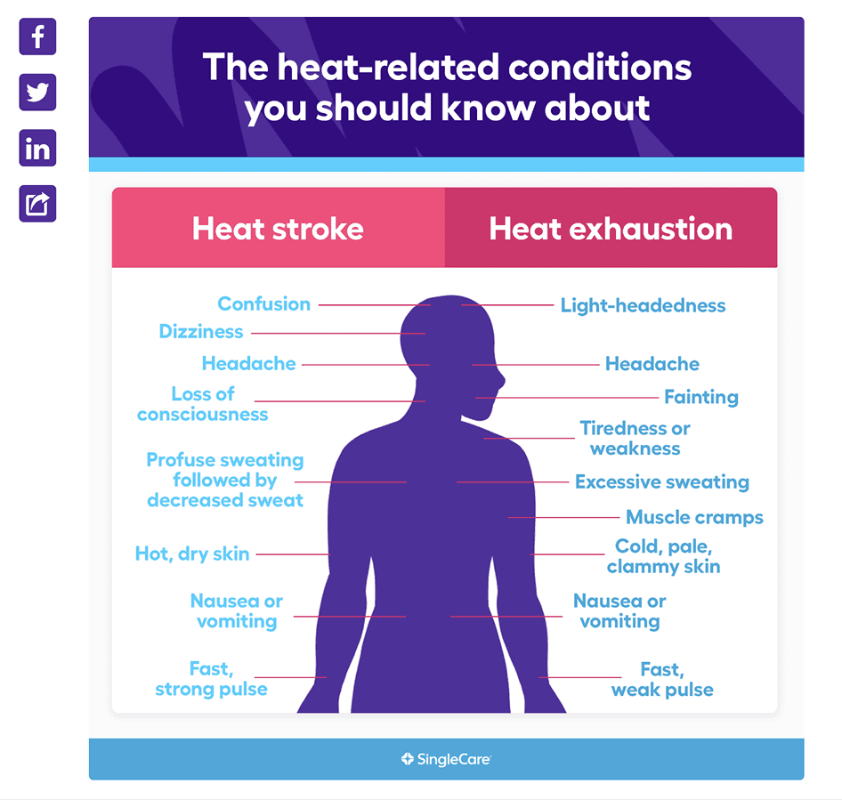
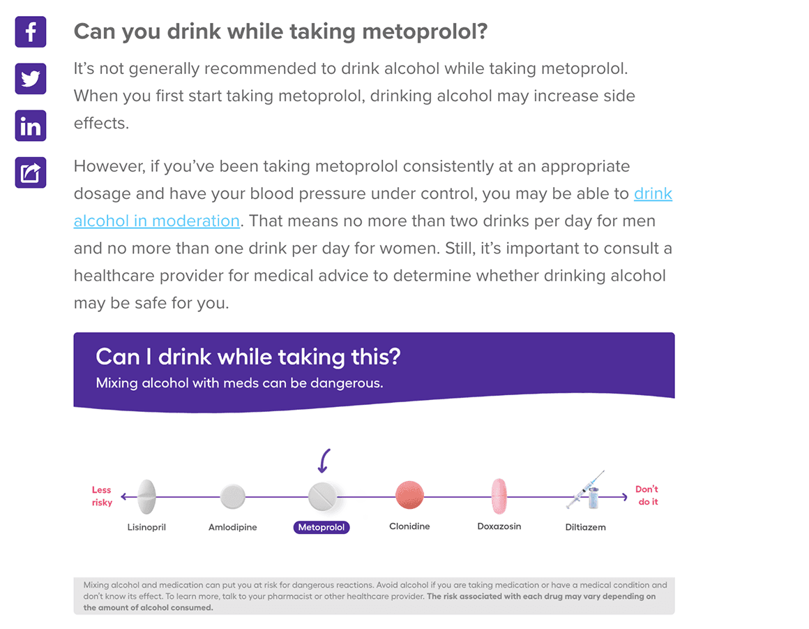
In-article charts
To improve readability and user engagement, we introduced infographics to break up dense text and visually communicate key information. This approach made complex health topics more accessible while also creating touchpoints to reinforce brand identity within the content.
To improve readability and user engagement, we introduced infographics to break up dense text and visually communicate key information. This approach made complex health topics more accessible while also creating touchpoints to reinforce brand identity within the content.
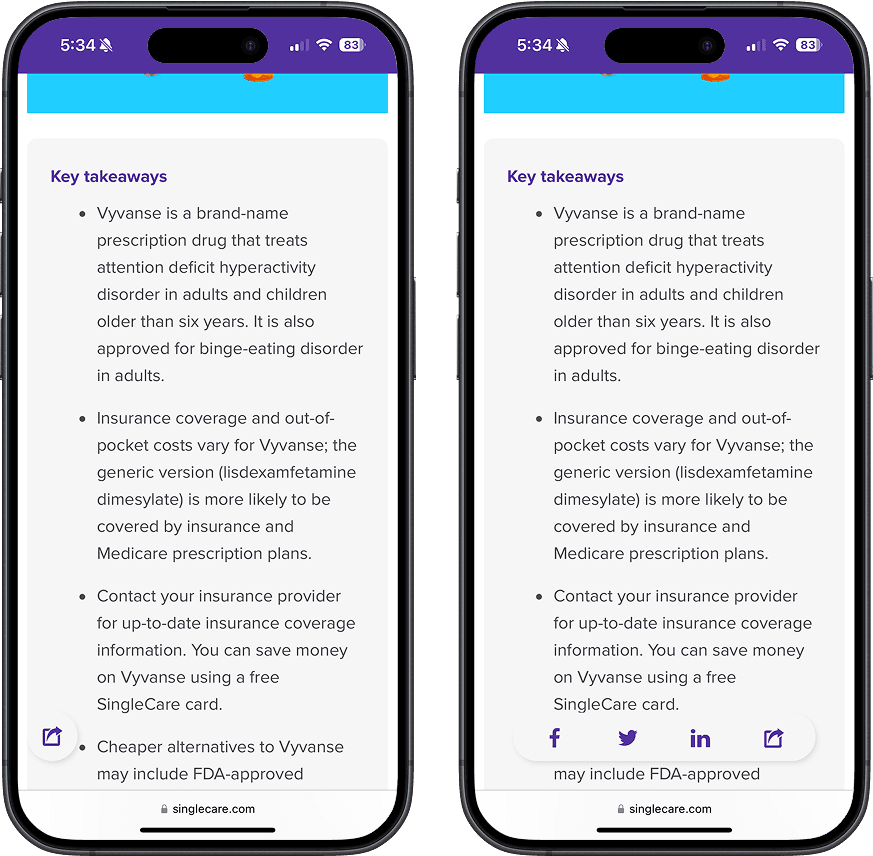
social share
We added a sticky social share bar to provide users with an immediate way to share articles directly to their social media or messaging platforms. By remaining visible as users scroll, this feature improved the reading experience by ensuring sharing options are always within reach. It reduces friction in the sharing process, making it more intuitive and convenient, which in turn gave a boost to user engagement and encourages broader content distribution, amplifying the blog's reach and impact.
We added a sticky social share bar to provide users with an immediate way to share articles directly to their social media or messaging platforms. By remaining visible as users scroll, this feature improved the reading experience by ensuring sharing options are always within reach. It reduces friction in the sharing process, making it more intuitive and convenient, which in turn gave a boost to user engagement and encourages broader content distribution, amplifying the blog's reach and impact.
On mobile, the share button was designed with a slightly different approach to enhance usability. It remained sticky but was positioned in the bottom-left corner of the screen, expanding into a full share menu when tapped.
This design choice aligns with key UX principles:
Accessibility: The bottom-left placement made the button easy to reach with a thumb, especially for right-handed users, enhancing one-handed usability.
Minimized Interference: Positioning the button away from the scroll bar prevented accidental interactions, ensuring a smoother navigation experience.
Focused Interaction: The expandable menu keeps the interface clean and distraction-free until the user chooses to engage with the sharing feature.
ad placement
initial ad addition
Generating revenue through advertising was a key priority for stakeholders, and our media team quickly implemented ads across the blog pages. However, I had significant concerns about the potential negative impact on user experience. The intrusive nature of these ads—bombarding users as soon as they arrived—created a cluttered and distracting environment. This not only made the blog articles harder to navigate but also risked driving users away from the site due to the poor overall experience.
Generating revenue through advertising was a key priority for stakeholders, and our media team quickly implemented ads across the blog pages. However, I had significant concerns about the potential negative impact on user experience. The intrusive nature of these ads—bombarding users as soon as they arrived—created a cluttered and distracting environment. This not only made the blog articles harder to navigate but also risked driving users away from the site due to the poor overall experience.

insights
Through research and testing, we were learned a few key insights about our users:
Through research and testing, we were learned a few key insights about our users:
All surveyed users
reported that they find
ads on websites to be
distracting
Users indicated that ads
positioned alongside
the blog content were
more acceptable than
those placed at the top
of the post
Users shared that they
occasionally click on
online ads when they
find them relevant to
their interests.
solution
We explored ways to incorporate ads into the blog while ensuring they felt more organic, relevant, and less intrusive. One idea we had was to embed ads directly within the article, ensuring the ad content was closely related to the topic for a more seamless and engaging experience.
We explored ways to incorporate ads into the blog while ensuring they felt more organic, relevant, and less intrusive. One idea we had was to embed ads directly within the article, ensuring the ad content was closely related to the topic for a more seamless and engaging experience.

sources
We added collapsible sources to the bottom of the blog posts, which offered several benefits for both the user experience and content credibility. Some of these benefits included:
Cleaner Layout: Collapsible sources kept the post visually clean and uncluttered, especially when there were many references.
Readers could focus on the content without being overwhelmed by a long list of citations
Optional Detail: This allowed users to access deeper information only if they chose, catering to both casual readers and those seeking in-depth understanding
Improved Navigation: Readers didn’t have to scroll past an extensive list of references to find related content or calls-to-action at the bottom of the post
Transparency: Providing sources enhanced trust by showing the research and evidence behind the content
Compliance: For health-related content, providing sources is necessary to meet guidelines for credibility, particularly in an industry where misinformation can have serious consequences

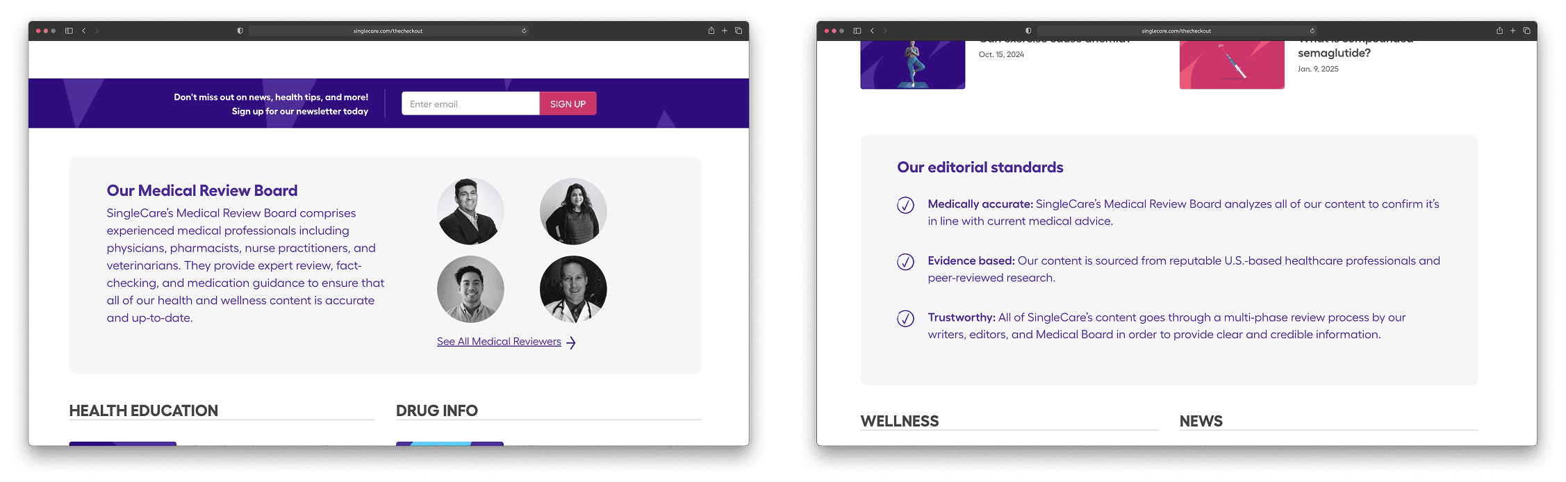
Editorial board
On our blog homepage, we introduced a dedicated section highlighting our medical review board and editorial standards. These additions reinforce credibility and trust by assuring users that every blog post is reviewed by qualified medical professionals and adheres to clear, rigorous editorial guidelines. This enhancement reassures readers that the medical advice provided is accurate, reliable, and trustworthy.
On our blog homepage, we introduced a dedicated section highlighting our medical review board and editorial standards. These additions reinforce credibility and trust by assuring users that every blog post is reviewed by qualified medical professionals and adheres to clear, rigorous editorial guidelines. This enhancement reassures readers that the medical advice provided is accurate, reliable, and trustworthy.
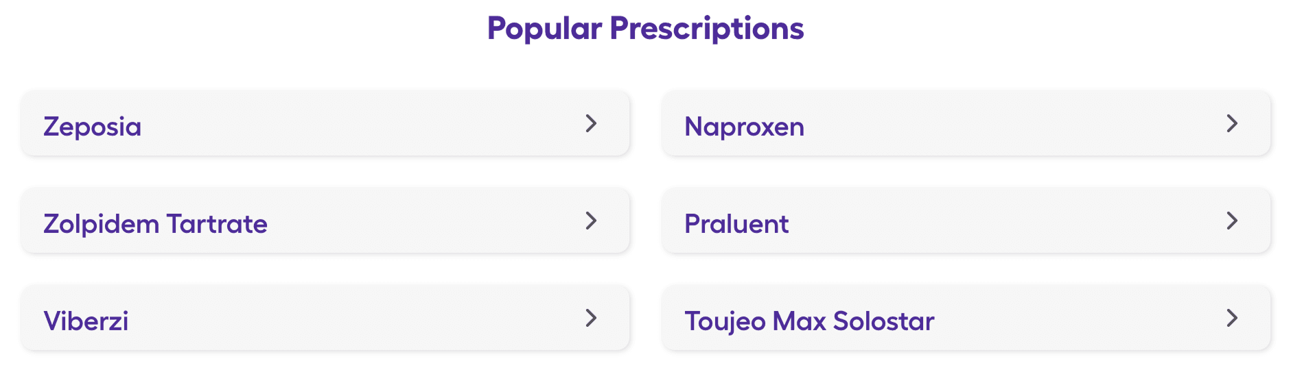
popular prescriptions module
A key objective from stakeholders was to implement SEO strategies that would improve our site's visibility and increase page visits. To achieve this, we introduced a "Popular Prescriptions" module at the bottom of each article, making it easier for users to find relevant prescriptions and encouraging them to explore more pages across the site.
A key objective from stakeholders was to implement SEO strategies that would improve our site's visibility and increase page visits. To achieve this, we introduced a "Popular Prescriptions" module at the bottom of each article, making it easier for users to find relevant prescriptions and encouraging them to explore more pages across the site.
cover guidelines
In an effort to bring a polished and “million dollar brand” feel to The Checkup and SingleCare while still retaining the unique brand voice and style, we re-vampted the existing blog art guidelines. While keeping a playful and approachable feeling, we wanted to create guidelines that would produce blog art that was a bit more polished and proessional.
In an effort to bring a polished and “million dollar brand” feel to The Checkup and SingleCare while still retaining the unique brand voice and style, we re-vampted the existing blog art guidelines. While keeping a playful and approachable feeling, we wanted to create guidelines that would produce blog art that was a bit more polished and proessional.
“Before” covers
The original blog cover art incorporated six different colors—green, yellow, magenta, blue, pink, and purple. The intention behind adding the extra brand colors (green, yellow, and magenta) was to make the art more vibrant and dynamic, helping it stand out and avoid feeling repetitive. This approach provided greater flexibility and creativity when designing the blog art.
The original blog cover art incorporated six different colors—green, yellow, magenta, blue, pink, and purple. The intention behind adding the extra brand colors (green, yellow, and magenta) was to make the art more vibrant and dynamic, helping it stand out and avoid feeling repetitive. This approach provided greater flexibility and creativity when designing the blog art.


revamped covers
After an internal brand review, we decided to narrow down the blog covers to feature the three main brand colors: pink, blue, and purple. I created around 50 approved background designs with the signature SingleCare "swoosh" as the backdrop, which served as a template for the new blog art. This shift helped establish a more polished and consistent look and feel across the blog. It also allowed me to delegate the task of crafting custom blog covers to a junior designer, providing him with an opportunity to grow while also fostering my development as a manager.
After an internal brand review, we decided to narrow down the blog covers to feature the three main brand colors: pink, blue, and purple. I created around 50 approved background designs with the signature SingleCare "swoosh" as the backdrop, which served as a template for the new blog art. This shift helped establish a more polished and consistent look and feel across the blog. It also allowed me to delegate the task of crafting custom blog covers to a junior designer, providing him with an opportunity to grow while also fostering my development as a manager.


In addition to creating background templates and a general blog cover art format, I created a color guide to ensure the proper balance of colors on the blog. According to the guide, purple should always be the dominant color on the homepage, maintaining a consistent ratio to ensure the blog's design aligns with the brand's visual identity.

icons
As a part of the blog updates, I hand-illustrated an icon set that was designed to create a more approachable and human-centered experience. In selecting an illustrative style, I aimed to achieve the following:
Human Connection: The hand-drawn feel of the icons adds warmth and personality to the interface, fostering a sense of connection between the user and the digital product. It conveys that the brand values creativity and individuality.
Differentiation: In a digital landscape saturated with minimalistic, geometric icons, the illustrative approach helps the site stand out. This unique style aligns with the project’s goal of making the brand memorable while staying user-friendly.
Brand Alignment: The SingleCare brand has an artistic, fun, or approachable identity, and these icons help tell the story of the brand’s values and aesthetic.
Flexibility Across Platforms: The illustrative style allows for scalability and adaptability. The icons can be used across the site, in email marketing, or even in print assets, creating a consistent visual language.
By integrating these custom-designed icons, the blog updates not only enhance usability but also contribute to an engaging and unique user experience.

design validation
While designing these features and updates, I periodically did A/B and user testing with our team internally to see if the designs were user friendly, or if they needed to be improved
Worked with editorial team to A/B test design options and decide which features would work best
Worked with product team to better understand the end user and update designs according to their insights
next steps
User Testing:
Continuously refine designs and run A/B tests with real users to gain deeper insights into the impact of these updates
Conduct user interviews to explore their perceptions of advertising, the credibility of the blog, and the usability enhancements
Feature Improvements:Rethink the search functionality, as the current experience feels clunky and makes it challenging to find specific topics
Continue iterating on more effective ways to display ads without disrupting the user experience
Revise text hierarchy within articles to improve clarity and make it easier to distinguish between sections
next steps
User Testing:
Continuously refine designs and run A/B tests with real users to gain deeper insights into the impact of these updates
Conduct user interviews to explore their perceptions of advertising, the credibility of the blog, and the usability enhancements
Feature Improvements:
Rethink the search functionality, as the current experience feels clunky and makes it challenging to find specific topics
Continue iterating on more effective ways to display ads without disrupting the user experience
Revise text hierarchy within articles to improve clarity and make it easier to distinguish between sections
