PROJECT
How strategic UX redesign reduced signup abandonment by 27% and coffee shop saves by 120%
UI Refresh
UX Research / Testing
Prototyping
cliff notes
Overview: Koffie empowers digital nomads and travelers to discover unique coffee shops through an intuitive mobile experience that connects them with local coffee culture wherever they go.
Challenge: Users needed a reliable way to find quality, unique coffee shops while traveling, but existing solutions lacked comprehensive information and local insights.
Solution: A research-driven app redesign with improved usability, refined design system, and new features that enhance coffee shop discovery and evaluation.
Impact: Enhanced user experience through strategic UX improvements and valuable feature additions that better serve the digital nomad community.

DATE
MY ROLE
TOOLS AND TECH
CORE TEAM
Sign-up Abandonment
%
decrease
Filter Task Completion
%
increase
Saved Shops
%
increase
step 1: define the problem
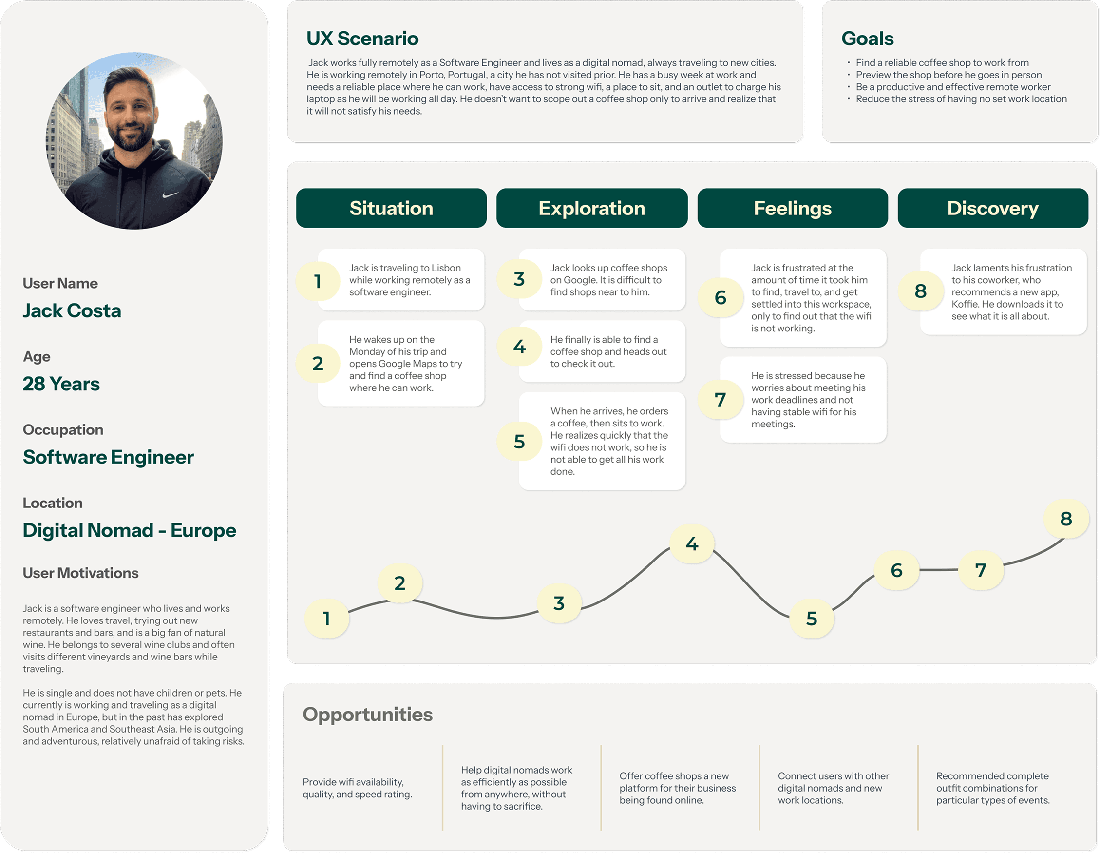
Koffie is an app designed for digital nomads and remote workers, helping them find coffee shops that are perfect for working on the go. Users can search, discover, and save coffee shops across various cities, filtering results by criteria tailored to the needs of remote workers.
While users have enjoyed the app, our user testing revealed opportunities to further improve the experience and deliver even greater value. This feedback guided our efforts to refine and improve the app.
User Problem
Digital nomads traveling to new cities face challenges in quickly identifying coffee shops that meet their needs for work-friendly environments. This results in wasted time, increased stress, and a less productive experience.
Step 2: research
I conducted a comprehensive UX audit to identify usability gaps and improvement opportunities.
Log-in and Sign-Up:
Poor information architecture and unclear CTAs were hindering user onboarding
Input Boxes:
Small input fields violated touch target guidelines, causing user errors and abandonment
Profile Pages:
An underdeveloped profile section limited user engagement and failed to leverage personalization for retention
Then I conducted user testing.
Building on insights from our app audit, we conducted user testing to gain a more holistic understanding of what was working well and where the app fell short. This allowed us to gather valuable feedback directly from users and uncover deeper insights into their needs and pain points.
Survey
Participants:
User interview
Participants:
Location
Countries:
Two key user types emerged from our research

Hayden
Hayden is a software engineer currently based in Southeast Asia, with previous experience living and working in Costa Rica, Argentina, Spain, and Germany. A true thrill-seeker, he enjoys surfing and engaging in adrenaline-fueled activities like skydiving, base jumping, and bungee jumping. Professionally, Hayden is driven, organized, and thrives in the autonomy that remote work provides.
Age:
32
Profession:
Software Engineer
Current location:
Thailand

Kami
Kami is a skilled graphic designer living the digital nomad lifestyle for the past two years. Although Rotterdam is her home base, she frequently takes weekend trips across Europe. While traveling, she enjoys discovering local bookstores, cafes, wine bars, and art galleries. A fan of unique stays, she often chooses distinctive Airbnbs that let her immerse in the local culture and cuisine. Professionally, Kami is a creative problem solver with a focus on working with clients in the consumer packaged goods industry. She is known for being both professional and punctual.
Age:
27
Profession:
Graphic Designer
Current location:
The Netherlands
Users shared some compelling insights

User 1
User 2
The user feedback revealed interesting patterns
Discovery Methods:
Most digital nomads relied on social media or Google Maps to find coffee shops while traveling and working.
Lack of Organization:
Participants generally lacked a structured method for saving or organizing their coffee shop discoveries.
Key Priorities:
When choosing a coffee shop, top priorities included Wi-Fi availability, convenient location, and access to power outlets.
step 3: ideate and prioritize

step 4: ui and visual design


TYPOGRAPHY
H1
Instrument Sans Bold
24/30
Duis aute irure dolor in reprehenderit in voluptate velit esse cillum dolore
H2
Instrument Sans Bold
18/22
Duis aute irure dolor in reprehenderit in voluptate velit esse cillum dolore
H3
Instrument Sans Medium
18/22
Duis aute irure dolor in reprehenderit in voluptate velit esse cillum dolore
H4
Instrument Sans Bold
16/20
Duis aute irure dolor in reprehenderit in voluptate velit esse cillum dolore
H5
Instrument Sans Medium
16/20
Duis aute irure dolor in reprehenderit in voluptate velit esse cillum dolore
Body
Instrument Sans Regular
12/16
Duis aute irure dolor in reprehenderit in voluptate velit esse cillum dolore
Descriptor
Instrument Sans Regular
10/14
Duis aute irure dolor in reprehenderit in voluptate velit esse cillum dolore
color palette

component library

step 5: high fidelity designs
Based on UX audit findings and user research insights, I developed a strategic roadmap targeting critical usability barriers and feature gaps.
Conversion Optimization: Redesigned onboarding flows to reduce friction and improve signup completion rates
Accessibility & Mobile Usability: Expanded touch targets for form elements to meet platform guidelines and reduce user errors
User Engagement: Enhanced profile functionality to create product stickiness through personalization and user investment
Discovery Experience: Implemented intelligent filtering to help nomads quickly identify work-friendly venues based on their specific needs
Information Architecture: Redesigned global search with consistent placement and improved discoverability across the app
Social Validation: Added community-driven reviews to leverage peer recommendations in venue selection decisions
To reduce onboarding friction and improve conversion rates, I redesigned the authentication flow with these key improvements:
Smart Navigation: Added seamless toggle between sign-in and sign-up modes to reduce cognitive load and eliminate dead-end experiences
Reduced Friction: Integrated social authentication (Google, Apple, Meta) to offer one-tap access and reduce abandonment from lengthy form completion
Visual Modernization: Redesigned authentication interface with contemporary styling that builds user trust and reflects product quality
Real-Time Validation: Implemented progressive error feedback that guides users to successful completion instead of frustrating post-submission failures

I redesigned the home screen to reduce cognitive load and improve task completion based on user behavior insights:
Improved Content Discovery: Replaced vertical scrolling with horizontal category navigation to increase content visibility and reduce decision fatigue
Streamlined Information Architecture: Removed redundant map access point after analytics showed 80% of users preferred the persistent bottom navigation
Optimized Information Hierarchy: Simplified coffee shop cards by surfacing only the most decision-relevant information identified through user testing
Enhanced Interaction Design: Increased like button touch targets to meet accessibility standards and reduce interaction failures
User-Centered Prioritization: Restructured card content based on testing insights showing users prioritize [specific info like WiFi quality, noise level, etc.] over secondary details"

User testing revealed critical usability barriers in the filter experience that were preventing successful task completion:
Filter Relevance: Redesigned filter categories based on user research showing that nomads prioritize workspace features (WiFi strength, power outlets, noise level) over traditional cafe attributes
Accessibility Compliance: Increased touch target sizes for interactive elements to meet WCAG guidelines, reducing interaction errors and user frustration
Improved Discoverability: Enhanced the dismissal interaction by adding visual depth cues and expanding the gesture area, making the swipe-to-close behavior more intuitive and learnable
Navigation Recovery: Redesigned the back button with increased visual prominence and consistent placement, preventing users from feeling trapped in the filter state


Enhancing Map Navigation and Filter Functionality
Filter usability barriers: Users struggled to locate and apply relevant filters (price range, ratings, hours), often abandoning their search when unable to narrow results effectively. I redesigned the filter interface with clearer visual hierarchy and intuitive categorization to streamline the refinement process.
Exit flow confusion: Testing revealed that users frequently got trapped in map view, unable to find a clear path back to the main navigation. I implemented a more prominent exit control and added breadcrumb navigation to provide clear wayfinding back to the home screen.

Redesigning Profile Navigation and Introducing Discovery Management:
Information architecture breakdown: Users struggled to locate essential account information due to poor visual hierarchy and unclear labeling. I restructured the profile layout with improved categorization and prominent section headers to create intuitive information pathways.
Missing discovery workflow: A critical insight emerged that users lacked a way to capture and organize coffee shops for future visits—a key behavior in the discovery-to-visit journey. I designed and implemented a dual-system approach with dedicated Favorites (visited and loved) and Wishlist (want to try) sections, enabling users to build personal coffee shop collections.

step 6: iteration
Proven Results: Successful Design Interventions
Enhanced task completion: Users demonstrated significantly improved success rates when filtering search results and navigating between core app sections, with reduced task completion times and fewer user errors.
Streamlined discovery management: The new Favorites and Wishlist functionality tested successfully, with users easily locating and organizing saved coffee shops without assistance—validating our hypothesis about collection behavior needs.
Improved interaction design: The redesigned heart icons and radio buttons received positive usability feedback, with users reporting more intuitive interactions and increased engagement with core features.
Elevated overall experience: Users consistently described the updated interface as more "breathable" and enjoyable, indicating successful improvements to visual hierarchy and information density.
Unsuccessful Solutions and Key Insights
Advanced collection management: Users expressed a desire for location-based wishlist organization, indicating that geographic context plays a key role in their coffee shop planning behavior—particularly for users who travel frequently or live in multiple neighborhoods.
Integrated map experience: Testing revealed friction in the current list-to-map transition, with users requesting a more fluid way to visualize search results spatially without losing their filtering context or search progress.
Live venue intelligence: Users consistently requested real-time operational data (crowd levels, seating availability, connectivity quality) to make more informed visit decisions—highlighting an opportunity to differentiate from competitors through dynamic venue insights.
