PROJECT
How strategic UX design generated 106% more specialist visits and 14.7k patient actions.
UX/UI Design
Mobile Focus
Data Visualization
cliff notes
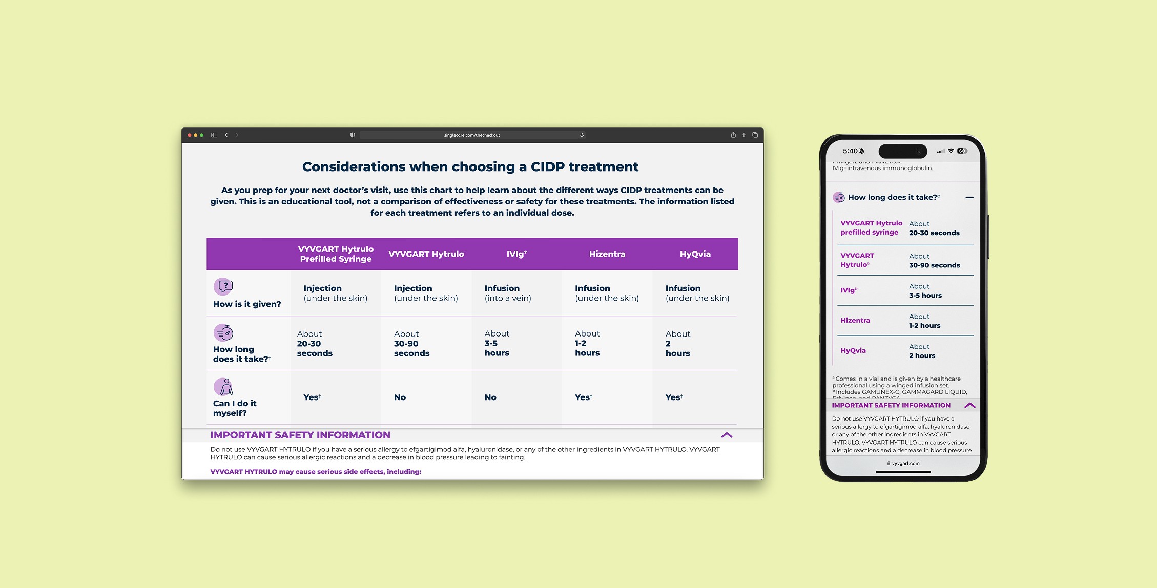
Overview: The Administration Comparison Tool empowers patients to compare VYVGART Hytrulo with other treatments through an intuitive, mobile-first interface, helping them make informed decisions and have meaningful conversations with their healthcare providers.
Challenge: Patients struggled to understand treatment differences and benefits across complex medical options.
Solution: A mobile-optimized comparison tool that transforms dense medical data into clear, visual treatment comparisons.
Impact: Enabled faster treatment evaluation and improved patient-doctor discussions about VYVGART Hytrulo benefits.
DATE
January 24, 2025-
May 5 2025
MY ROLE
UX/UI Design Lead
TOOLS AND TECH
Figma
Adobe Illustrator
Adobe Photoshop
Workfront Proof
Jira
CORE TEAM
1 UX/UI Designer
1 UX Director
2 Developers
2 Strategists
1 Creative Director
3 Legal Reviewers
A peek into the impact of this project:
Neurologist Visits
%
increase
High-Intent User Actions
k
in Q2 alone
Task Completion
%
of goal
step 1: define the problem
User Problem
Patients struggle to compare treatment options, finding it difficult to understand why one medication may be better than another. They need a straightforward way to evaluate benefits and drawbacks across different treatments.
This project balanced user-centered design principles with strategic business objectives, while navigating the constraints of strict legal and regulatory review.
The project was anchored by a set of clearly defined goals.

Galvanize patients
around VYVGART
Hytrulo’s benefits

Empower patients to learn about their treatment options and speak to their doctor

Cultivate an elevated experience for patients on VYVGART Hytrulo’s
website
Step 2: research and inspiration

A few key insights emerged from my competitive research:
Mobile layouts are often overwhelming and hard to navigate.
Tabs hide important information, making it difficult for users to see everything at a glance.
Charts feel clinical and intimidating, discouraging engagement.
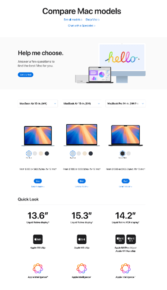
Apple’s comparison tool offered a strong example of a clean, airy design with scannable information, supported by helpful iconography and imagery to guide users through dense, potentially overwhelming content.
Step 3: design
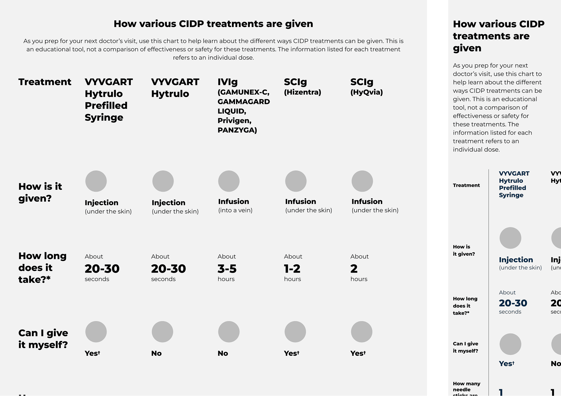
I designed three variations to review with the team and test with users to better understand their preferences. I created working prototypes to best demonstrate the functionalities of each design.
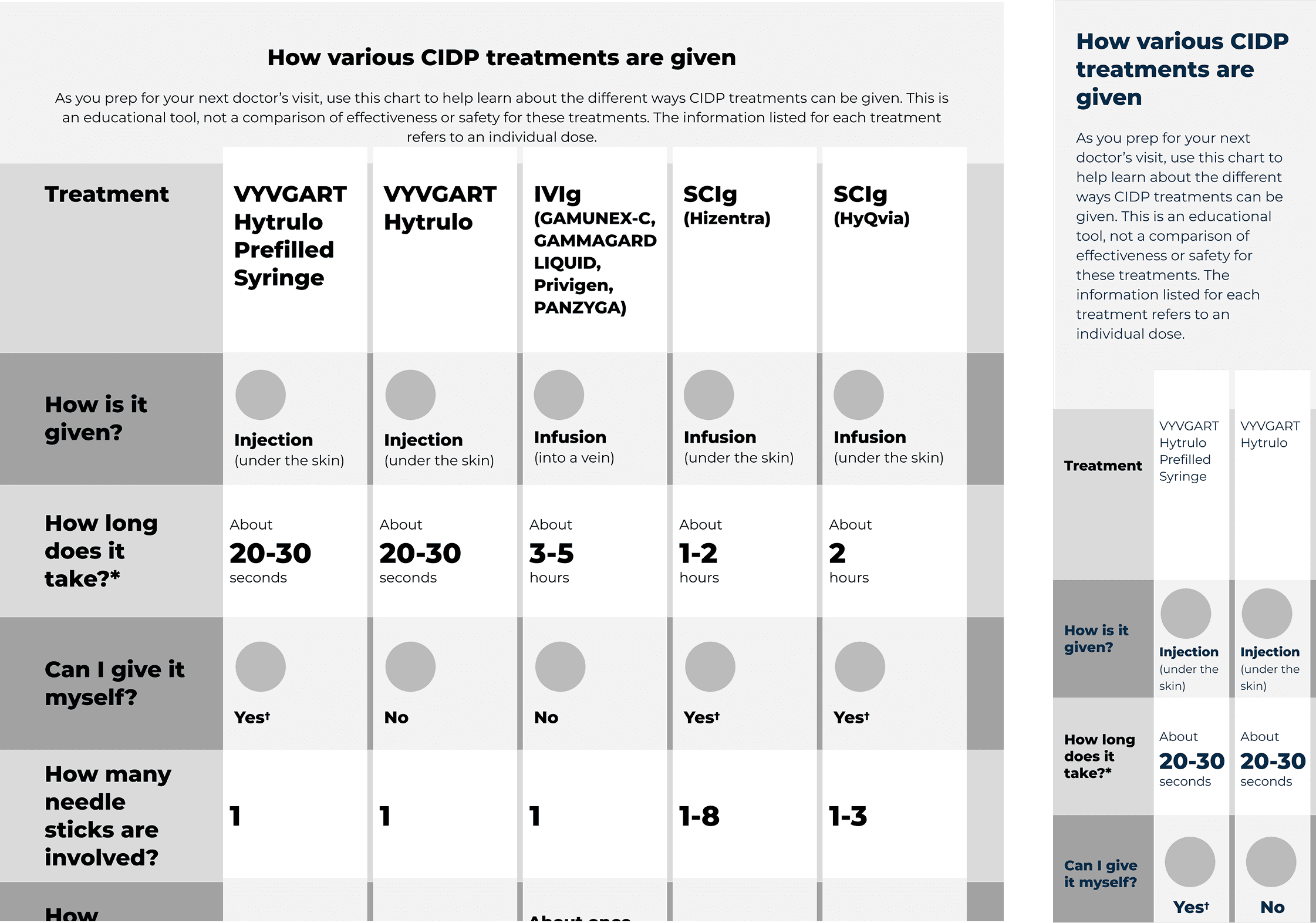


Feedback from user testing, along with input from the team, guided the refinement and iteration of the design. The process surfaced several key takeaways.
step 4: A/B testing
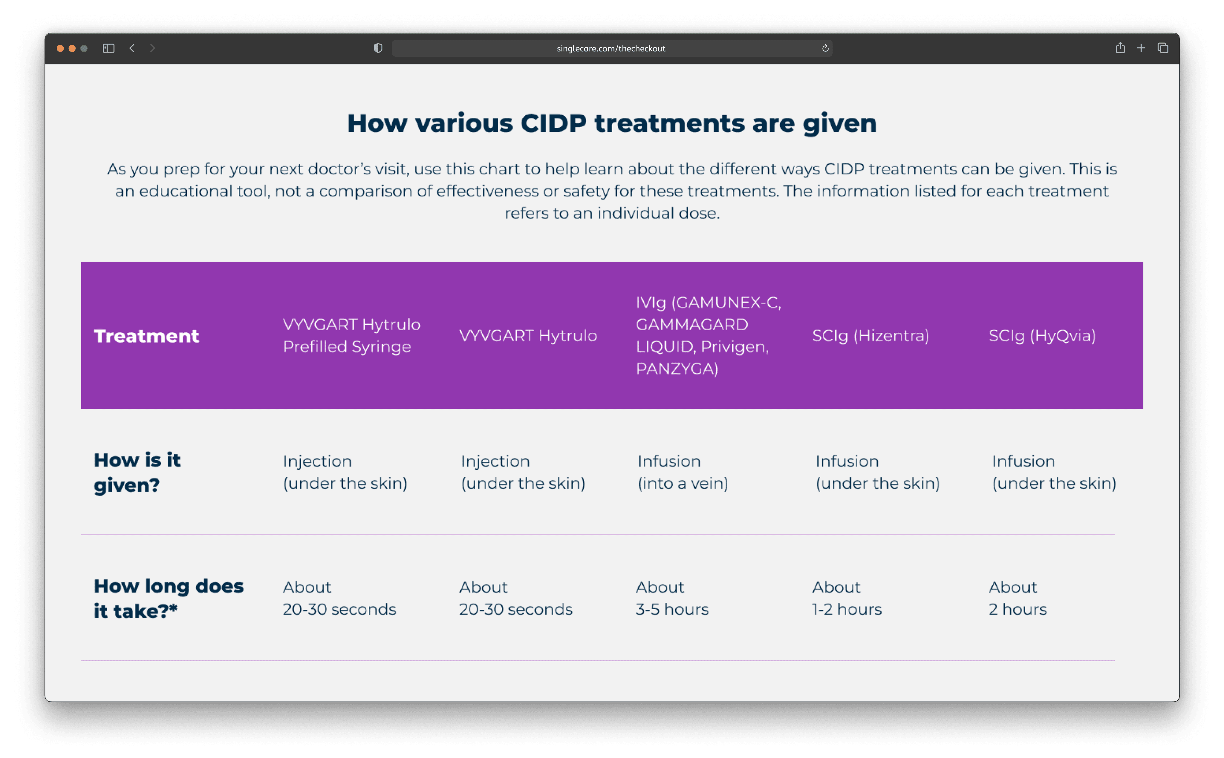
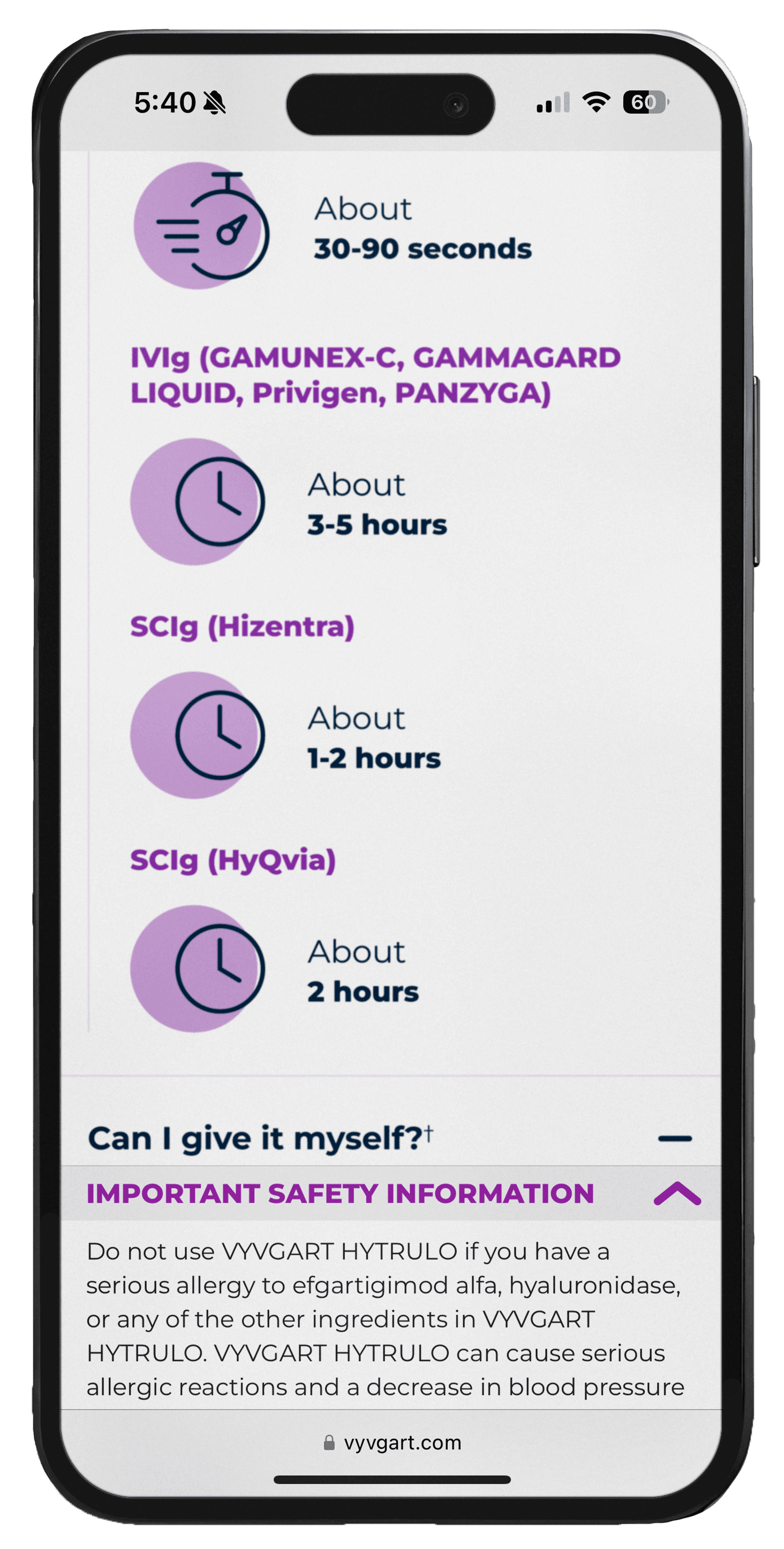
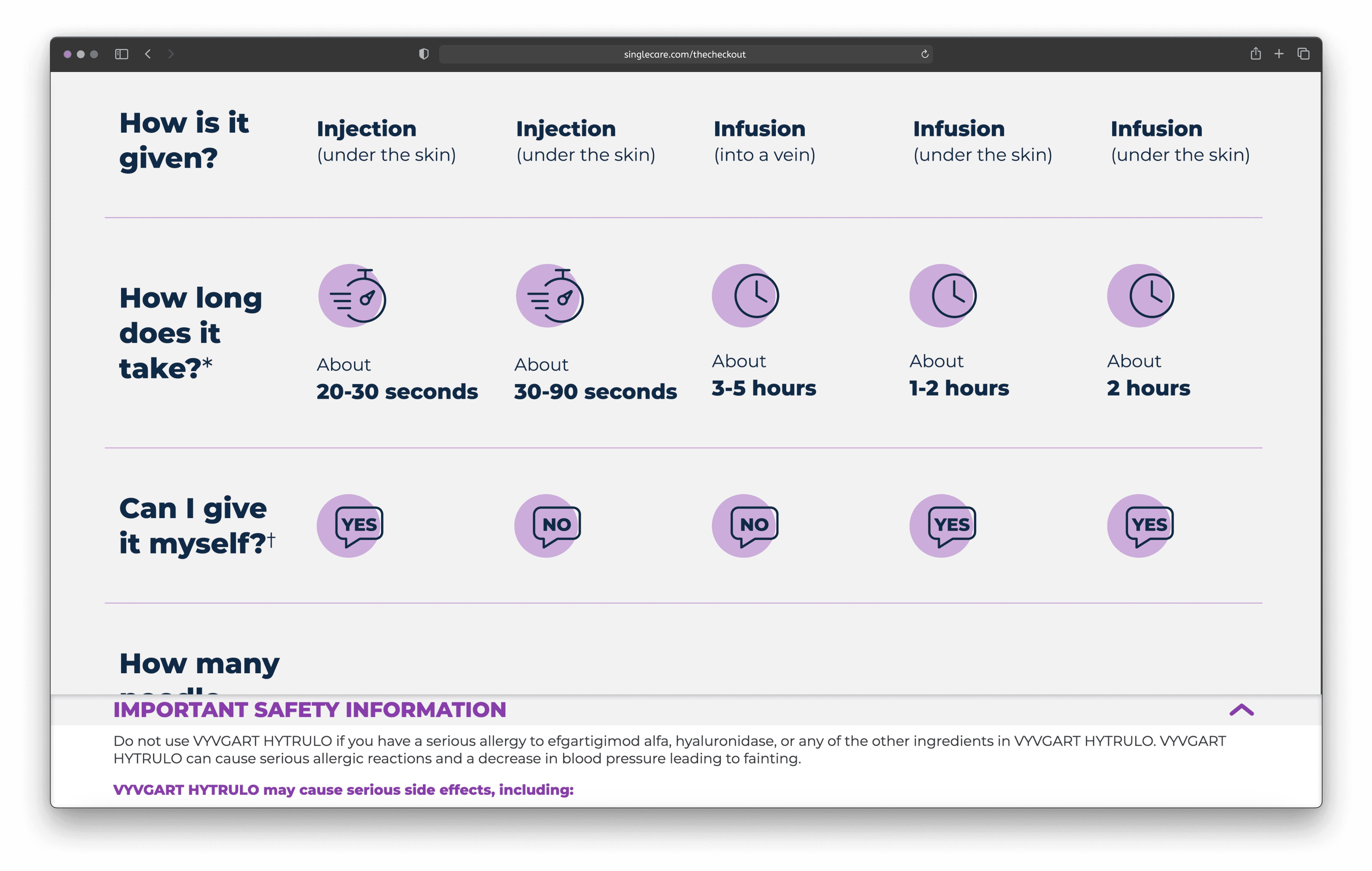
Both on desktop and mobile, an Important Safety Information (ISI) tray will be visible on the page, which partially obstructs the screen. To ensure users could still compare multiple treatment options at once, I carefully considered the height of each row, ensuring the design accommodated the ISI tray without compromising usability or clarity.

During testing, I noticed users struggled with the horizontal scroll section—it wasn’t immediately clear that the scroll direction would change. This insight led me to realize that the mobile design needed to be revised, and one of the other designs would be a better fit for moving forward.

Users reported confusion with the functionality of this design, as it wasn't immediately clear what action they needed to take. I realized we would either need to add instructional text or an icon to explain the functionality. However, this solution felt clunky and unnecessarily complicated for users.

The team appreciated the simplicity of the third solution but felt it lacked visual interest, making the dense text feel overwhelming for users. We needed to find a way to add engaging elements without compromising the clean, straightforward design.
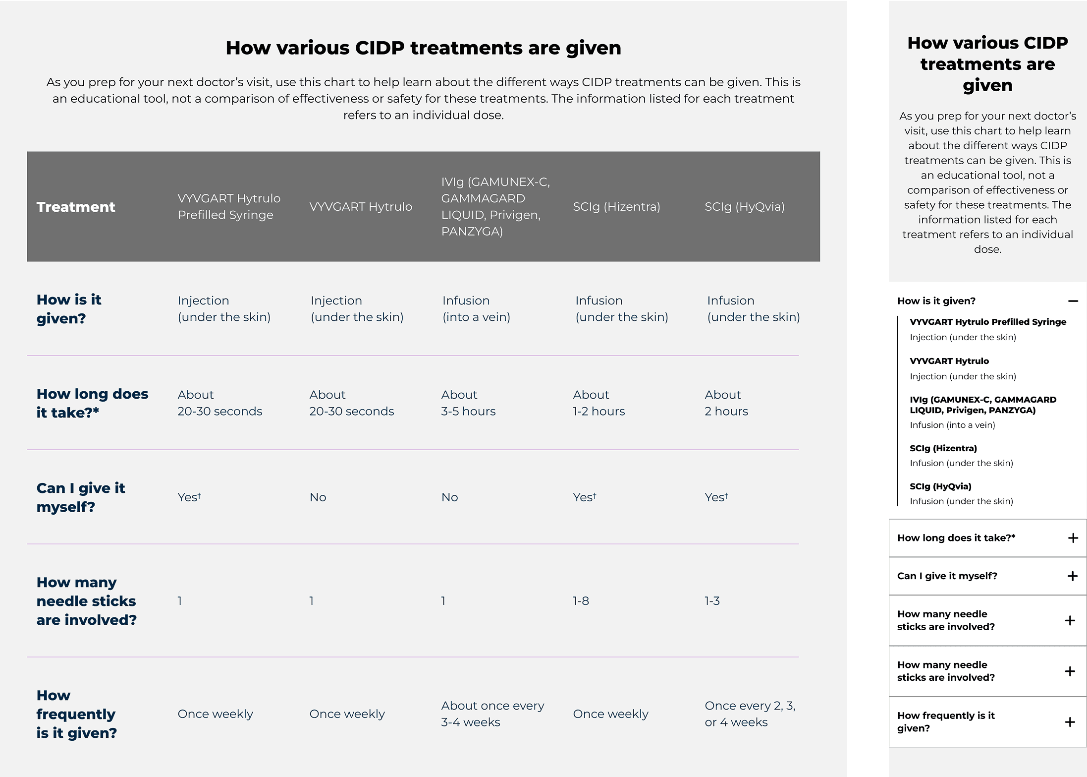
step 5: iterate
For the next design iteration, I narrowed down to a single concept based on user and team feedback. I focused on refining the use of icons — aiming to ensure they added meaningful context rather than serving as purely decorative elements.
On mobile, the experience adapted to flipped axes and leveraged purposeful icons and elevated typography to improve content hierarchy and readability.
For the third iteration, I was determined to keep icons in the design. I moved them from within the rows, to out in the column. This helped to differentiate the different column headings, while still using icons to create visual interest and break up the text.

step 6: analyze impact + iterate
Neurologist Visits
High-Intent User Actions
Task Completion
Users successfully navigated complex treatment comparisons without confusion, resulting in a 106% increase in neurologist visits. This shows that users moved from research to action and the tool facilitated meaningful doctor-patient conversations.
We saw 448 patient conversions to VYVGART Hytrulo through the website channel.
186% task completion goal achieved, demonstrating superior usability.
The website achieved 41.8x targeting precision, reaching diagnosed patients at 41+ times the expected rate.
Working on this project was a welcome challenge that allowed me to redefine what's possible in the traditionally conservative pharmaceutical space. I was able to push boundaries and create a tool that is genuinely user-friendly across both desktop and mobile—an experience often lacking in the antiquated pharma industry.
The power of early, iterative testing: Complex user flows require continuous validation, especially when users are making high-stakes healthcare decisions
Small details, big impact: Design decisions as seemingly minor as icon placement can dramatically affect user comprehension and task completion
Simplicity with purpose: The art of balancing clean, accessible design with visual engagement becomes even more critical when presenting complex medical information
Regulatory constraints as creative catalysts: Working within strict pharmaceutical guidelines pushed me to find innovative solutions that serve users while meeting compliance requirements
Refinement & Testing: Continuously iterate on designs and conduct usability tests to assess how easily users understand and navigate the comparison tool.
User Interviews: Gather qualitative insights through interviews to explore user sentiment around VYVGART Hytrulo and identify opportunities for enhancing the comparison experience.
Traffic Monitoring: Track engagement metrics to evaluate if users are interacting with the tool effectively and completing desired calls to action.
